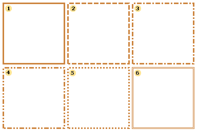
Border Sides
Each border consists of 4 segments: top side, left side, bottom side, right side. These segments may be shown together or in different combinations. For example:
Using the Border.Side property, you can set up on which sides a border will be visible.
Border Style
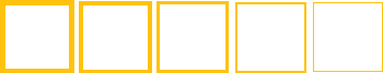
Seven styles of borders are available - Solid, Dash, Dash Dot, Dash Dot Dot, Dot, Double, and None. With simple borders, a selected style is applied to all sides of the border at the same time. Examples of each type of border are shown below:
 Solid;
 Dash;
Dash;
 Dash Dot;
 Dash Dot Dot;
 Dot;
Dot;
 Double.
The style of borders can be selected using the Border.Style property. You can also set the border color and thickness.
Border Color
The border color can be set using the Border.Color property. When using simple borders, the selected color is applied to all visible border sides. The image below demonstrates components with different border colors.

Border Thickness
When using simple borders, the border thickness is applied to all visible border sides. The border thickness can be set using the Border.Size property. The image below demonstrates components with different border thicknesses.
You should know that the border thickness is ignored if the Double border style is enabled.
 Notice. The border size is ignored if the Double style is set in the Border.Style property.
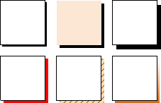
Shadow
A component that has borders may have a shadow. A shadow has three parameters:
 Border.DropShadow - a boolean property. If it is set to true, then a Shadow will be shown
Border.ShadowBrush - the brush to use to draw a shadow;
Border.ShadowSize - the size of a shadow.
Shadow Styles
Five types of brushes are used to draw a border: Solid, Hatch, Gradient, Glare, and Glass.
These styles can be combined with the other shadow properties to apply a wide range of different appearances to report components. A few examples:
Setting Simple Border Properties
You can set simple Border properties directly from the Object Inspector, or using the Borders Toolbar.
Object Inspector
To set properties from the Object Inspector click the ellipsis button beside the Border property
A new dialog will be displayed that allows you to set the options for the border of the component:
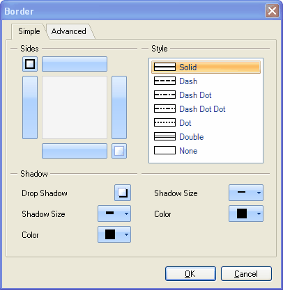
Select the settings you would like to apply and click the OK button to close the dialog and update the border.