Virtually any data structure, data type and layout can be defined in CORE-GS.
To provide this flexibility, the user interface changes based on the selected table:
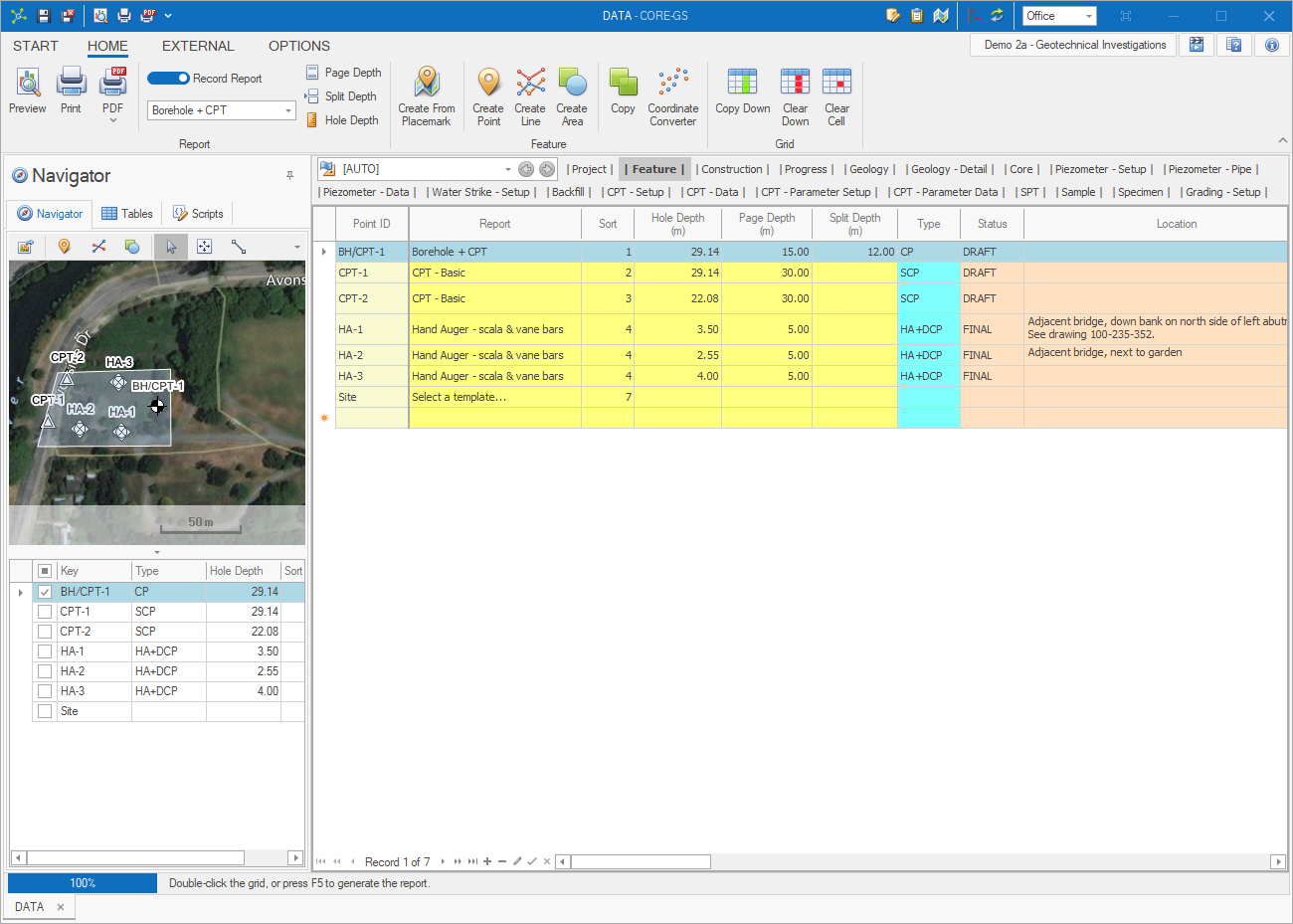
The Table Navigators (Table Tree and more functionally Workflow Toolbar) work together with the Record Navigator to define the data shown in the Data Grid:
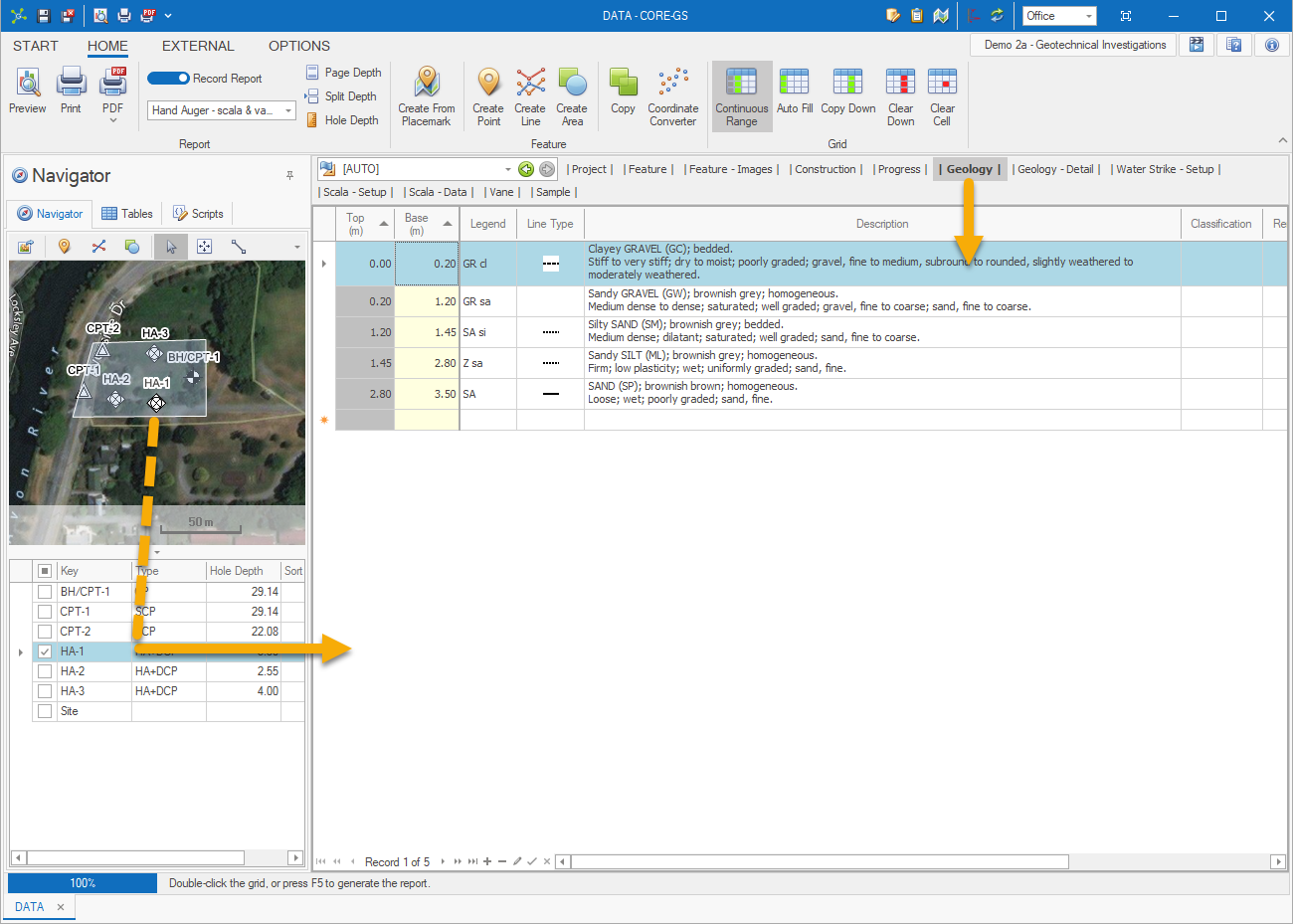
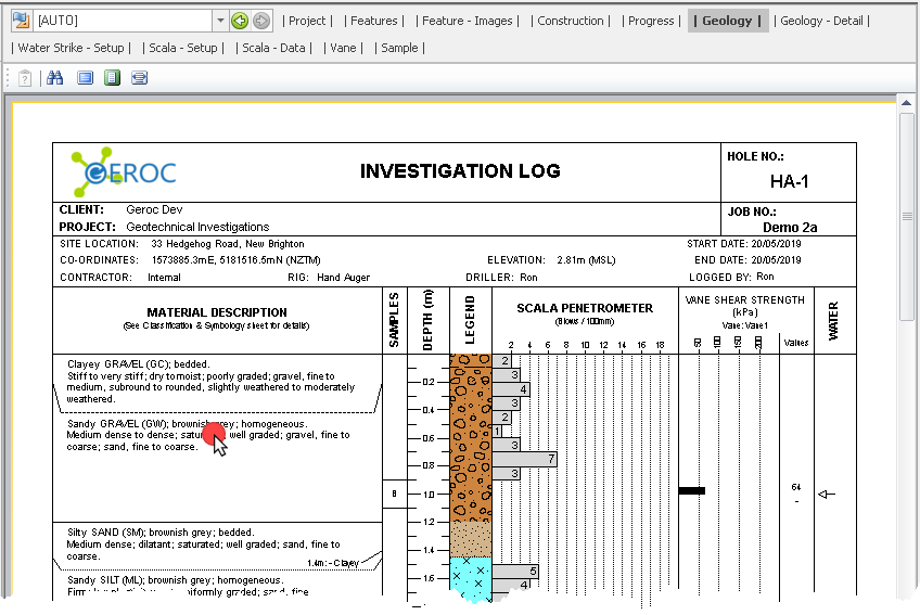
Additionally, report previews can be used to navigate tables and records:
•single mouse click - highlights the Workflow Toolbar table used in a report region
•double mouse click - changes the table / record associated to the clicked report component
Data changes can be manually saved at any time by clicking the Save ![]() button (CTRL+S) on the Quick Access Toolbar . Otherwise data changes are automatically saved when changing table or navigation record. If more frequent saving is required, the Record Commit mode can be enabled to automatically save any changes when leaving a record:
button (CTRL+S) on the Quick Access Toolbar . Otherwise data changes are automatically saved when changing table or navigation record. If more frequent saving is required, the Record Commit mode can be enabled to automatically save any changes when leaving a record:

If changes have been made that you do not want saved, clicking the Cancel ![]() button (CTRL+Z) on the Quick Access Toolbar will discarded any changes (one or more record) since the last save.
button (CTRL+Z) on the Quick Access Toolbar will discarded any changes (one or more record) since the last save.
The Data Grid provide many advanced features that users can use to visualize data in different ways for each table:
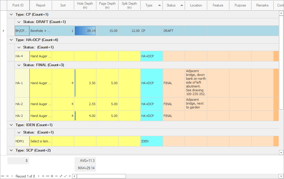
Including:
•Column width
•Column order
•Column visibility
•Column sorting
•Row groups
•Row height
•Row filters
•Conditional formatting
•Summaries
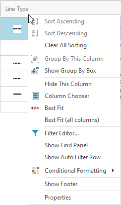
Most options are available through the column contextual menu shown by right-clicking the column header:
How To: Change column width
![]() Click on the column separator with the left mouse button, then drag the separator left or right:
Click on the column separator with the left mouse button, then drag the separator left or right:
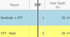
![]() Release the left mouse button once the desired width is reached.
Release the left mouse button once the desired width is reached.
How To: Sort columns
![]() Click on the column header with the left mouse button:
Click on the column header with the left mouse button:

|
Sort can be applied to multiple columns by holding down the SHIFT key. |
|
Sort cannot be changed when Continuous Range mode is enabled. |
How To: Hide columns
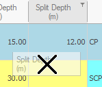
![]() Click on the column header with the left mouse button, then drag the header down onto the grid:
Click on the column header with the left mouse button, then drag the header down onto the grid:

![]() When an X appears, release the left mouse button:
When an X appears, release the left mouse button:
How To: Unhide columns
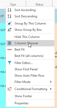
![]() Right-click on the column header to show the contextual menu, then click Column Chooser:
Right-click on the column header to show the contextual menu, then click Column Chooser:
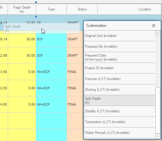
![]() Left-click on the required column and drag it to the column header, using the indicators to determine the position before releasing the mouse button:
Left-click on the required column and drag it to the column header, using the indicators to determine the position before releasing the mouse button:
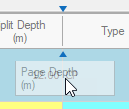
How To: Move columns
![]() Click on a column header with the left mouse button, the begin to drag the header left or right:
Click on a column header with the left mouse button, the begin to drag the header left or right:

![]() Use the indicators to determine the position before releasing the mouse button:
Use the indicators to determine the position before releasing the mouse button:
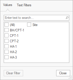
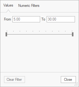
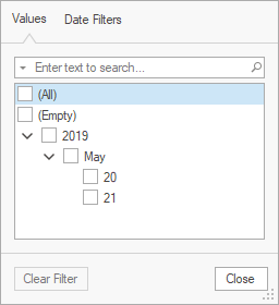
How To: Filter columns
![]() Click on filter glyph on the column header to show the filter options for the current column:
Click on filter glyph on the column header to show the filter options for the current column:
![]()
Text |
Numeric |
Date / Time |
|
|
|
![]() Filters are automatically applied.
Filters are automatically applied.
Rows and columns can be navigated and selected using:
•mouse
•keyboard
•embedded navigator
Various cell editors can be used to improve usability and ensure input consistency.
