|
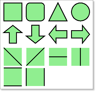
The Dynamic Shape component is used to render shapes where two depth values (Top Depth and Base Depth) are used to allow placements of components over exact ranges. It has the following shapes: rectangle (or square), rounded rectangle, triangle, oval (or circle), arrow plus a variety of lines shapes.
Most often Dynamic Shapes will be used simply as shapes. Additionally they can be used as Leaders linking a dynamic component to an exact depth on a Log Page. This is often required when too much text is printed in a small area of the Log Page resulting in the Dynamic Text (single or dual) component being shifted to avoid overlapping of text.
As such there are two Walk Through demonstrations below; the first looks at the simple case, while second looks at using the Dynamic Shape component as a Leader.

 Place an Dynamic Shape component on the SPT column. Place an Dynamic Shape component on the SPT column.
 In the Property Grid Set the Top Depth and Base Depth expressions to the appropriate data columns in the SPT table. In the Property Grid Set the Top Depth and Base Depth expressions to the appropriate data columns in the SPT table.
 Set Plot As Range to True. Set Plot As Range to True.
 Set the Shape Type to Arrow, and Direction to Down. Set the Shape Type to Arrow, and Direction to Down.
 Preview the report. Preview the report.
Try altering other properties in the Property Grid to see the many variations that are possible.
|
 Create a Log Column with the GEOLOGY table as the Data Source. Create a Log Column with the GEOLOGY table as the Data Source.
 Duplicate the column by copying (select the Log Column Container and then press Ctrl+C) then pasting (press Ctrl+V) it next to the first Log Column, remembering to reset the Master Component to the Log Body component. Duplicate the column by copying (select the Log Column Container and then press Ctrl+C) then pasting (press Ctrl+V) it next to the first Log Column, remembering to reset the Master Component to the Log Body component.

|
Note: It is not possible to use a Leader For Description Text to link two components on the same Log Column.
|
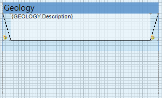
 On one of the Log Columns place a Dual Depth Text component, set the Text property to the Description column of the GEOLOGY table, set Top Depth and Base Depth expressions and set the Plot As Range property to False (default). On one of the Log Columns place a Dual Depth Text component, set the Text property to the Description column of the GEOLOGY table, set Top Depth and Base Depth expressions and set the Plot As Range property to False (default).
 On the same Log Column, adjacent to the Dual Depth Text component above, place a Dynamic Shape component. In this case set BOTH the Top Depth and Base Depth expressions to the GEOLOGY tables base column. This is done as the component is being used to link the Base of two dynamic components. On the same Log Column, adjacent to the Dual Depth Text component above, place a Dynamic Shape component. In this case set BOTH the Top Depth and Base Depth expressions to the GEOLOGY tables base column. This is done as the component is being used to link the Base of two dynamic components.
•If the Dynamic Shape is placed to the LEFT of the Dual Depth Text component set Plot As Range to False (default), Plot As Leader to True, Plot Reverse to False (default) and the Shape Type to Diagonal Line Down •If the Dynamic Shape is placed to the RIGHT of the Dual Depth Text component set Plot As Range to False (default), Plot As Leader to True, Plot Reverse to True and the Shape Type to Diagonal Line Up  Set the Min Size Height value of the Dynamic Shape to 0.001 so that it is rendered where there is no offset between components (ie the Leader is horizontal) Set the Min Size Height value of the Dynamic Shape to 0.001 so that it is rendered where there is no offset between components (ie the Leader is horizontal)
 Your final setup should look similar to the image below: Your final setup should look similar to the image below:

 Preview the report. Preview the report.
|
 Create a Log Column with the SPT table as the Data Source. Create a Log Column with the SPT table as the Data Source.
 Place a Single Depth Text component, set the Text property to the N-value column of the SPT table, set Top Depth expression. Place a Single Depth Text component, set the Text property to the N-value column of the SPT table, set Top Depth expression.
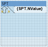
 On the same Log Column, adjacent to the Single Depth Text component above, place a Dynamic Shape component. In this case ONLY set the Top Depth expression (mid depth can be calculated like {(SPT.TOP + SPT.Base)/2} if desired) to the SPT tables top column. On the same Log Column, adjacent to the Single Depth Text component above, place a Dynamic Shape component. In this case ONLY set the Top Depth expression (mid depth can be calculated like {(SPT.TOP + SPT.Base)/2} if desired) to the SPT tables top column.
•If the Dynamic Shape is placed to the LEFT of the Single Depth Text component set Plot As Range to False (default), Plot As Leader to True, Plot Reverse to False (default) and the Shape Type to Diagonal Line Down •If the Dynamic Shape is placed to the RIGHT of the Single Depth Text component set Plot As Range to False (default), Plot As Leader to True, Plot Reverse to True and the Shape Type to Diagonal Line Up  Set the Min Size Height value of the Dynamic Shape to 0.001 so that it is rendered where there is no offset between components (ie the Leader is horizontal) Set the Min Size Height value of the Dynamic Shape to 0.001 so that it is rendered where there is no offset between components (ie the Leader is horizontal)
 Add another Dynamic Shape component as explained in Walk Through 1 in this topic. Add another Dynamic Shape component as explained in Walk Through 1 in this topic.
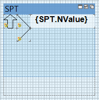
 Your final setup should look similar to the image below: Your final setup should look similar to the image below:

 Preview the report. Preview the report.
 Try adding a second leader to define a range, simple copy and paste the Dynamic Shape, change the Shape Type to Diagonal Line Up and set the Top Depth expression to the SPT tables Base column. Try adding a second leader to define a range, simple copy and paste the Dynamic Shape, change the Shape Type to Diagonal Line Up and set the Top Depth expression to the SPT tables Base column.


|
TIP: Filters can be applied to control whether the component is shown of not.
|
|
Property
|
Default Settings
|
Notes
|
Top Depth
|
(not set)
|
Expression built using the Text Editor, evaluated value is used to position the top of the component on the page.
|
Base Depth
|
(not set)
|
Expression built using the Text Editor, evaluated value is used to position the base of the component on the page.
|
Plot As Range
|
False
|
If false, the component ignores all Top Depth values (starts from the top of the Page) while its Base Depth is used to control its bottom placement. The second component to print then starts at the Base Depth of the first component. If true, the component is placed exactly using both the Top and Base Depth values. If there are gaps and overlapping between components is possible in this mode.
|
Plot As Leader
|
False
|
Specifically for use the Diagonal Line Up and Diagonal Line Down shapes as Leaders. A leader points to where the component was actually intended to be placed.
|
Plot Reverse
|
False
|
|
Variable Width Maximum
|
1
|
Sets the value representing 100% width. For instance this may be 50 for SPT N-values.
|
Variable Width Value
|
(not set)
|
Expression built using the Text Editor, evaluated value is used to calculate a variable width for the component.
|
Shape Type
|
Rectangle
|
Select from one of 11 shape types all fully customizable.
|
Style
|
Solid
|
Sets the line style of the shapes edges.
|
Size
|
1
|
Sets the line size of the shapes edges.
|
Border Color
|
Black
|
Sets the line color of the shapes edges.
|
Left
|
(various)
|
Indicates the left position of the component with respect to the component on which it is placed.
|
Top
|
(various)
|
Indicates the top position of the component with respect to the component on which it is placed.
|
Width
|
(various)
|
Can be changed by typing the value in the Property Grid or dragging either the right or left edge to a new position.
|
Height
|
(various)
|
Can be changed by typing the value in the Property Grid or dragging either the top or bottom edge to a new position.
|
Min Size
|
0,0
|
Specifies the minimum size that the component can be rendered. For Dynamic Shapes as Leaders this should be set to 0.001 to force rendering of horizontal lines.
|
Brush
|
Solid | Transparent
|
Sets the background color and style
|
Conditions
|
[No Conditions]
|
Sets certain properties of the component depending on present condition.
|
Component Style
|
(not set)
|
If component styles are being used in a report this property can be used to quickly update the components style.
|
Use Parent Style
|
False
|
If True the style of the Page is used for the style of the Log Body band
|
Grow To Height
|
False
|
If True, grows to height of Parent component (data band) to avoid spaces where other components height is greater.
|
Dock Style
|
None
|
Determines how the component docks in the Parent container.
|
Enabled
|
True
|
If True, the component will be rendered. If False, the component is not be rendered. This is useful for turning on and off parts to the report without needing to delete items
|
Interaction
|
(not set)
|
Sets Bookmarks etc for report navigation
|
Printable
|
True
|
If True, component will be rendered and printed. If False, component will be rendered but not printed.
|
Print On
|
All Pages
|
Sets which pages of the rendered report the component will be on, various options
|
Shift Mode
|
Increasing Size
|
If neighbor components have AutoWidth, CanGrow, CanShrink set True these can affect the component by overlapping. Setting the Shift Mode adjusts the position of the component to avoid this.
|
(Name)
|
(auto-generated)
|
Names are auto-generated on creation, but these can be changed for ease of reading if required.
|
(Alias)
|
(not set)
|
Can be set if Alias names are being used during design
|
(Globalized Name)
|
(not set)
|
|
Restrictions
|
All
|
Restricts changes to the component. Various options
|
Lock
|
False
|
If True the components position cannot be altered
|
Linked
|
False
|
If True, links a component to its Parent container so that it can be freely placed outside the container, but is still rendered by it.
|
|
|
